






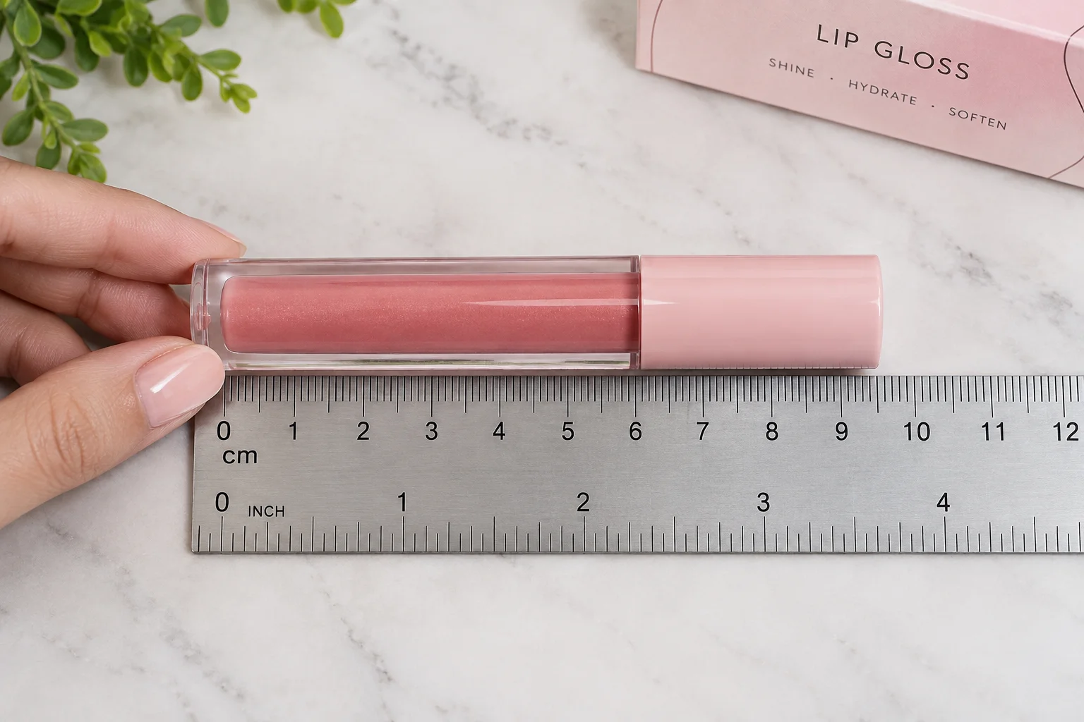
The fill figure on a lip gloss tube tells you nothing about the carton it needs. A 10 ml tube is short and wide on one component line and tall and narrow on the next. One supplier lists a 16 mm slanted tip tube in both 5 ml and 10 ml sizes. That same source makes the point that two tubes of one capacity differ in length once the diameter changes. So the carton comes from the closed tube with its cap fitted and a rule laid against it. Every idea below starts from that measured tube rather than from a number on a fill sheet.
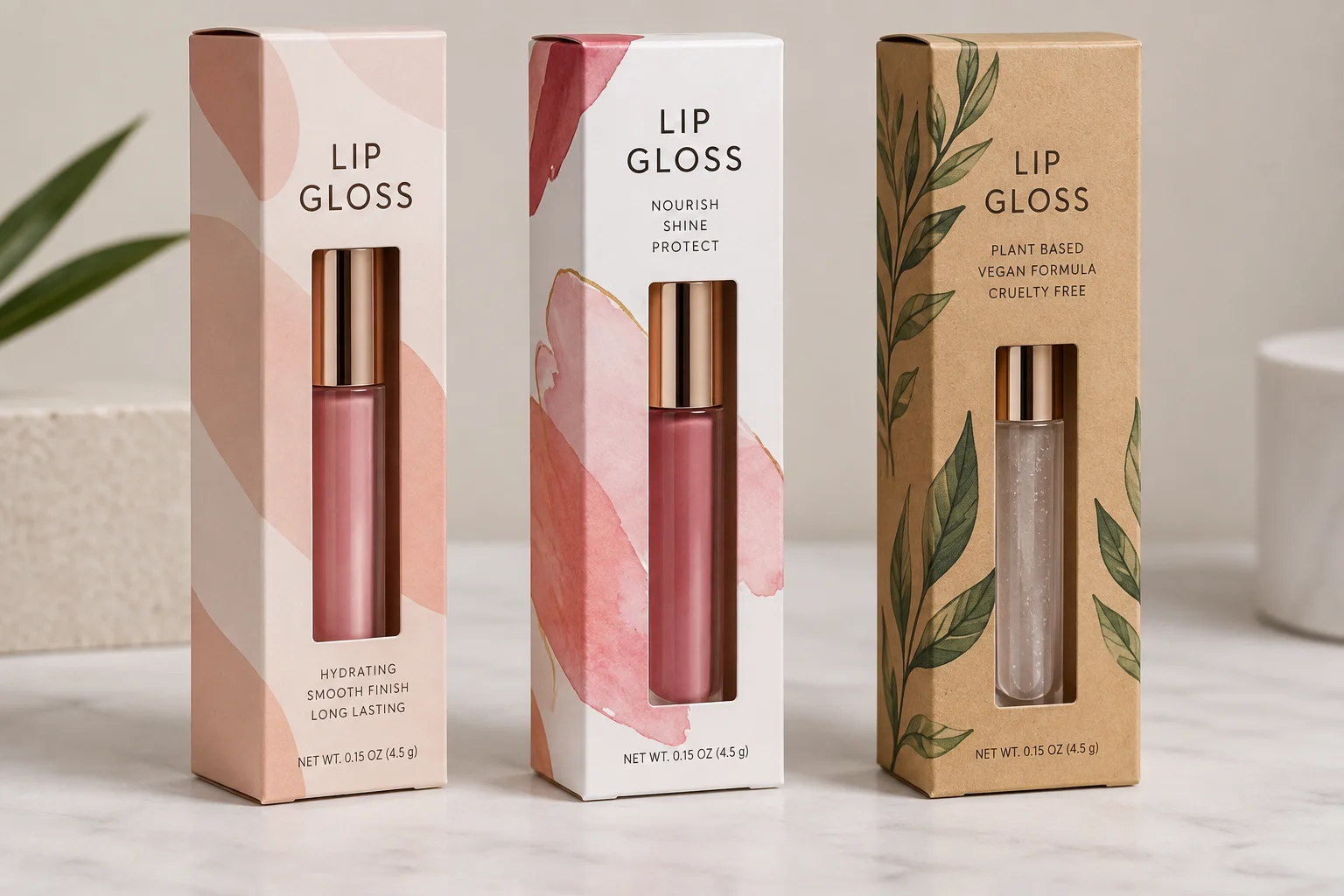
This article runs through ten lip gloss packaging ideas and states what each one does to the carton and to the quote. Each section names the board, the film, the cut or the insert that the idea actually needs. It is written for brand owners and private label sellers who are about to order cartons and want the specification behind the look. None of this is styling advice on its own because every idea listed changes a line on the job sheet.
The short version
- The fill never sizes the carton. A doe foot tube is published at 10.5 cm by 1.6 cm at 8 ml, a 10 ml dispensing tube at 3 1/4 inches, and two tubes of the same capacity differ in length by diameter. We measure the closed tube.
- Pick the structure before the look. The carton, the insert and the window all come off one dieline, so a change of mind about the window after approval means a new die.
- Foil and spot UV need a matte ground to read at all. On a gloss carton both disappear, which is the most common reason a finish looks like it was wasted.
- A black or deep matte carton scuffs between the plant and the shelf. An anti scratch matte film costs a little more than standard matte and it is the difference between a clean box and a shiny rub mark.
- Every idea is quoted as its own line, so you can see what each one adds. The minimum stays 100 boxes per size and design whichever ideas you stack.
How Do You Size a Lip Gloss Carton Before Picking a Look?
Sizing starts with the filled tube in its closed state and the cap seated all the way down. Measure the height at the tallest point, the width at the widest point and the cap at its outer edge. Add the applicator collar into that width if it sits proud of the tube wall. Those three readings become the inside dimensions of the carton once tolerance goes on top of them.
Published component figures show how far apart two similar tubes really sit. A doe foot applicator tube is published at 10.5 cm tall and 1.6 cm wide with a suggested 8 ml fill. A dispensing tube holding 10 ml is published at 3 1/4 inches long and that works out near 8.3 cm. The larger fill sits in the shorter tube because the diameter is doing the work instead of the height.
| Tube type | Published size | Suggested fill | What it does to the carton |
|---|---|---|---|
| Doe foot applicator tube | 10.5 cm tall by 1.6 cm wide | 8 ml | Tall and slim so the carton runs narrow and deep |
| Dispensing tube | 3 1/4 inches long | 10 ml | Shorter than the doe foot tube at a bigger fill |
| Slanted tip squeeze tube | 16 mm diameter body | 5 ml | Smallest footprint and the least label room |
| Slanted tip squeeze tube | 16 mm diameter body | 10 ml | Same diameter as the 5 ml with a longer body |
Read the first and last rows together and the point lands. Two tubes with the same 16 mm diameter differ only in length while a fill of 10 ml appears twice at two different heights. A dieline drawn from the fill figure alone misses by several millimeters in either direction. Our walk through on how to measure a box for packaging sets out the same three readings in more detail.
Tolerance is the gap you leave between the tube and the board. A tight carton drags on the tube as it goes in and a loose carton lets the tube rattle on a shelf. We allow one to two millimeters on the width and on the depth of a folding carton. The height gets a little more than that so the tuck flap closes without pressing down on the cap.
Board choice follows the weight of the tube and the finish you want on the surface. Retail lip gloss cartons run 300 to 350 GSM SBS which measures roughly 0.35 to 0.46 mm in caliper. Kraft board covers the unbleached natural look and wrapped rigid covers the gift and set formats. Most single tube work lands on folding cartons in one of the four structures below.
| Structure | How it opens | Board route | Best fit |
|---|---|---|---|
| Straight tuck end | Both flaps tuck in from the same side | 300 to 350 GSM SBS | Single tube retail carton with a clean front |
| Reverse tuck end | Flaps tuck in from opposite sides | 300 to 350 GSM SBS | The most economical single tube carton |
| Sleeve and tray | Printed tray slides out of a printed sleeve | SBS or kraft board | Duo sets and gift presentation |
| Two piece rigid | Lid lifts off a wrapped base | Wrapped rigid board | Limited editions and multi shade sets |
Idea 1: Build the Carton Around the Measured Tube
A carton cut to the measured tube is most of what people call a good unboxing. The tube stands where you set it and the flap closes flat without a bulge across the front panel. A carton cut to a rounded guess leaves the tube leaning against one wall of the box. Buyers read that lean as a cheap product long before they read anything printed on the panel.
Our custom lip gloss boxes all start from a dieline drawn around the closed tube we have measured in hand. Send us one filled tube and the measuring happens here rather than over email. That single step removes the most common reason a first production run gets reprinted.
Fit changes three things on the job sheet at once. The inside dimensions set the flat size of the blank, the sheet yield and the board cost. The tuck depth sets how firmly the flap holds under the weight of a full tube. The glue flap position decides whether the carton opens from the top or from the end.
A slim doe foot carton and a squat dispensing tube carton use nearly the same board area in the end. The tall one gains height and gives it back in width so the two blanks land close together. That is why the look of the finished carton has far more effect on price than the fill does.
Idea 2: Pick the Film or Coating That Reads Smooth in the Hand
A smooth carton is a result rather than a specification on the job sheet. The specification is the film or the coating that produces the surface you feel. Gloss film, matte film, soft touch film, aqueous coating and spot UV are the five treatments in play. Each one behaves differently under a thumb and each one lands on the quote as its own line.
| Finish | Surface it gives | Handling behavior | Where it fits |
|---|---|---|---|
| Gloss lamination | Wet shine that deepens every color | Hides light handling marks well | Bright shades and heavy photography |
| Matte lamination | Flat velvet with no reflection | Shows marks on dark solids | Quiet modern layouts |
| Soft touch lamination | Low sheen with a rubbery drag | Marks from oil on the hands | Premium dark cartons |
| Aqueous coating | Light satin seal straight off press | Moderate scuff resistance | Kraft board and light artwork |
| Spot UV over matte | Gloss pattern on a flat field | Strong where the pattern sits | Logos, shade names and pattern work |
Lamination is a film laid over the printed sheet and it adds a step after press. Coating is a fluid applied in line and it seals the sheet without adding a separate pass. We quote either one as its own line on the sheet so you see exactly what the surface costs. There is no setup or tooling charge sitting underneath that line.
Aqueous coating is the route that suits kraft board and light pastel art on a tight budget. It seals the fiber and keeps the board looking uncoated rather than laminated. A gloss film on the same kraft sheet fights the material and the natural look disappears under the shine.
One caution applies to every smooth finish on a lip gloss carton. Lip gloss leaks and that single fact decides which surface belongs on the board. A film laminated carton resists a smear of product far better than a coated one and it wipes clean. If your tube has any history of weeping at the collar then the laminated film pays for itself.
Idea 3: Run a Pastel or Minimal Layout Without Losing the Shade
Pastels are light tints and light tints are the hardest thing to hold on a press. A pale pink built from four process inks shifts as the ink film weight moves through the run. Ink film weight, board brightness and press speed all move a light tint while the sheets are running. The same tint printed as a solid spot color holds from the first sheet to the last. Anyone running a pastel across several cartons in a range should price the spot color before the artwork is final.
Our explainer on how CMYK builds a light tint shows why a 6 percent screen drifts while a solid does not. The short form is that a pastel is mostly paper with a thin veil of ink over it. Small movements in that veil are visible to the eye because there is so little ink to hide behind.
Board affects the tint as much as the ink does. SBS board is bright white so a pastel prints close to the value you approved on screen. Kraft board is warm brown so the same pastel goes muddy and loses its identity as a color. A pastel range belongs on white board and a kraft range belongs on inks with enough weight to survive the base.
Minimal layouts run into the label rules faster than busy ones do. A clean front panel with one logo still has to carry the brand name, the statement of identity and the net quantity. Designers who leave no allowance for that copy end up adding it at proof stage in a type size nobody planned. Draw the required copy into the minimal layout from the first sketch and the calm look survives.
| Pastel route | Consistency through the run | Cost effect | Board it suits |
|---|---|---|---|
| Four color process tint | Drifts with ink film weight | No extra line on the quote | SBS for accuracy |
| Solid spot color | Holds from first sheet to last | One extra ink line | SBS or kraft |
| Tinted uncoated board | Fixed by the material itself | Board line changes | Kraft and specialty stock |
| Process tint with a spot accent | Accent holds and the field drifts | One extra ink line | SBS only |
Idea 4: Print a Bold Black Carton and Plan for the Scuffing
Black sells gloss because it makes a bright shade look brighter next to it. A black lip gloss carton is also the least forgiving surface in packaging. Every crease mark, every fingerprint and every rub against another carton shows up on a dark solid. Planning for that at the specification stage costs nothing and ignoring it costs a reprint.
A rich black built with a cyan under layer looks deeper than black ink on its own. That heavy coverage is exactly what cracks along a fold if the board is scored short. A 300 to 350 GSM SBS carton scored properly takes a rich black across the fold without breaking. The score allowance goes on the dieline and not on the artwork.
Film choice decides how the carton looks after a week in a shipper. Gloss lamination hides handling marks on black better than any other option in the list. Matte lamination looks superb on day one and shows a shiny scuff wherever something rubs it. Our piece on scuff marks on dark cartons sets out what causes the marks and how the specification prevents them.
Gold and white are the two marks that hold their edge on a black ground. White knocks out of the black and reads at any size above the ingredient list. Gold arrives as a foil rather than an ink because a printed gold on black goes flat and muddy. A black carton with a white wordmark and one small gold element is the combination this category runs most. It needs only one foil pass on top of the print.
Type on a black carton needs more air than type on white. Knocked out white text at a small size fills in as ink spreads into the counters of the letters. Push the smallest copy on a black panel a point larger than you would on a white one. The ingredient list is the block that suffers first because it runs at the smallest size on the carton.
Idea 5: Put Gold or Silver Foil Where the Eye Lands
Foil is a metal film pressed into the board with a heated die. It reflects real light rather than imitating a metal with ink. That is why a foiled logo still reads as expensive under warehouse lighting while a metallic ink logo goes flat. Our explainer on foil stamping covers the die, the pressure and the film in full. Gold, silver, copper, rose and matte black all run on the same stamping press.
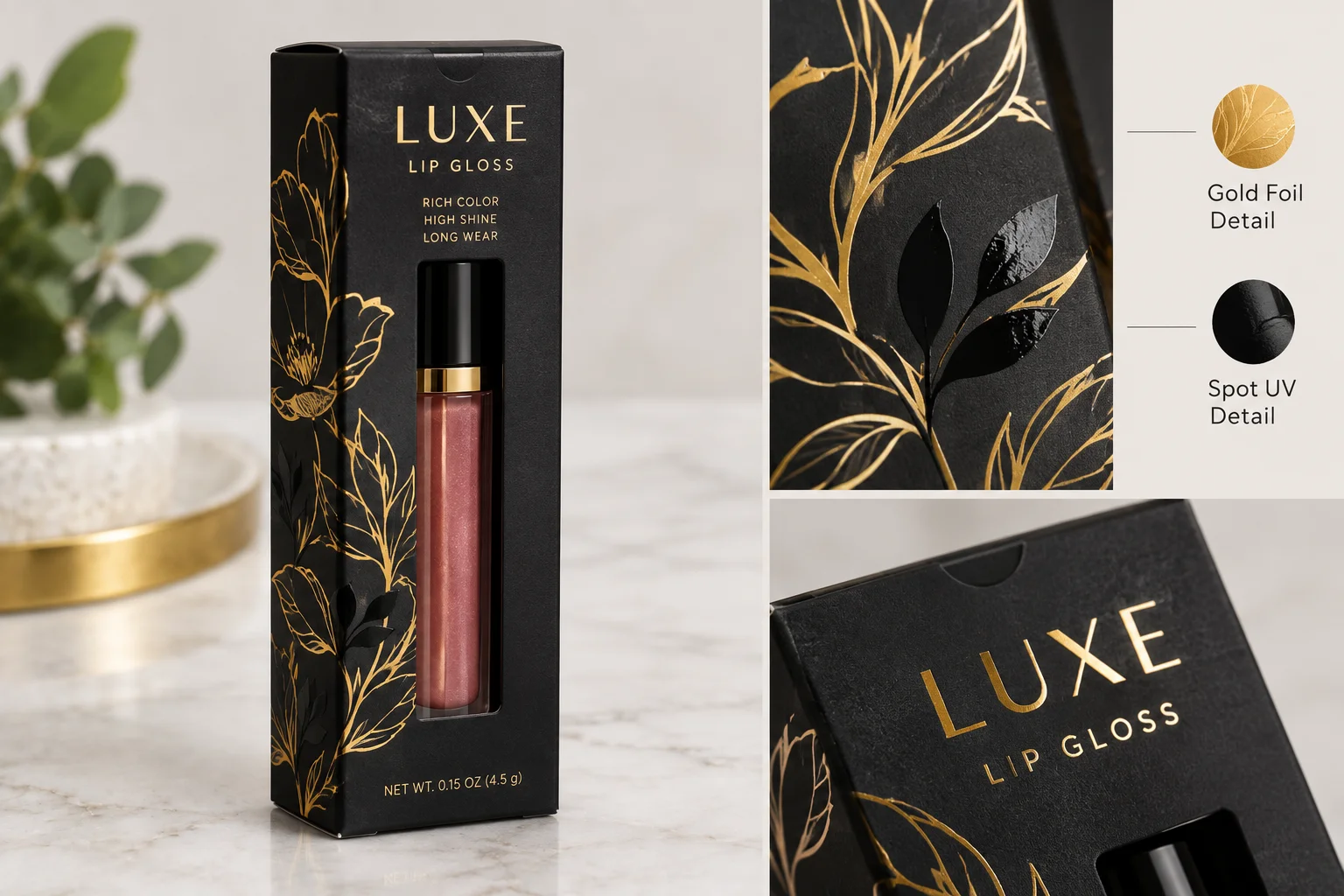
The mistake with foil is spreading it across the whole panel. Foil works by contrast alone and contrast needs a clean unfoiled field around it. A brand mark, a shade name or a single rule at the base of the panel is the right amount. On a carton sized for a 1.6 cm tube that is a genuinely small area of metal.
Fine detail sets the real limit on a small carton. Hairlines under about half a point fill in as the heated die presses the film into the board. Text below roughly 6 point loses its counters in the same way. Send the foil art as a separate solid black layer with nothing screened inside it and the die comes out clean.
| Metallic route | How it behaves | Detail limit | Best use on a gloss carton |
|---|---|---|---|
| Hot foil stamping | Reflects light like polished metal | Hairlines above half a point | Logo and shade name |
| Cold foil | Flatter reflection and prints in line | Finer than hot foil | Large decorative areas |
| Metallic ink | Sheen without a mirror finish | As fine as normal print | Pattern work and backgrounds |
| Spot UV over matte | Gloss with no metal at all | Fine but needs contrast | A pattern behind a foiled mark |
Foil and spot UV work together on one carton when the plan separates them. Foil takes the brand mark and spot UV takes the pattern or the shade name below it. Both effects sit on a matte field because a gloss field around them cancels the contrast you paid for. That split is the most requested finishing specification on the beauty cartons we print.
Send us one filled tube
We measure the closed tube here and draw the dieline around it, then quote the finishes as separate lines so you can see what each idea adds.
Idea 6: Let Modern Artwork Cover the Whole Front Panel
Full bleed artwork means the image runs off every edge of the blank with nothing trimming into it. That needs 3 mm of bleed past the cut line on all four sides of the dieline. Build the art at 300 dpi at final size, add the bleed, and keep live copy 4 mm inside the cut line. A lip gloss front panel is small so any softness in the file is obvious at that scale.
Abstract shapes, gradients and photographic texture all print well across a folding carton. The one thing all of them fight is the fold across the middle of the blank. A gradient crossing a score line breaks visually at the crease because the board surface changes direction there. Keep the strongest part of any gradient inside a single panel and the artwork survives folding.
Panel hierarchy matters more on a small carton than on a large one. A front panel drawn around a 16 mm tube holds one image, one brand mark and one short line of type. Add a fourth element and something has to shrink below the size at which it reads. Move the rest of the story onto the side and back panels where there is room to read it.
Artwork built for screen rarely survives a press without adjustment. Deep saturated blues, vivid oranges and clean bright greens live outside what four process inks reproduce on board. Approve a printed sample before the full run whenever a single color carries the whole identity of the range.
Idea 7: Cut a Window and Patch It So the Shade Shows
A window sells the shade without asking the buyer to open anything. It works on a shelf, in a product photograph and in an unboxing video. It is also a hole cut out of the panel you just paid to print. Both of those statements are true at the same time and the design has to hold them together. The window goes where the tube actually sits and not where the layout leaves a gap.
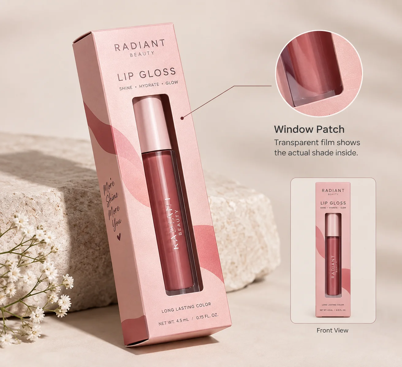
A patched window carries a clear film bonded behind the cut. An open window leaves the aperture empty and lets dust reach the tube. Patching adds a die and a patching pass and both appear as their own lines on the quote. For a retail carton facing a shelf the patch is worth it because the window stays clear.
| Window route | What the buyer sees | Structural effect | Label effect |
|---|---|---|---|
| Patched clear window | The shade through clean film | Panel keeps most of its stiffness | Removes usable print area |
| Open die cut window | The tube with nothing over it | Weakens the panel more than a patch | Same loss of print area, no dust barrier |
| No window with a shade swatch | A printed square of the color | Panel stays at full strength | Swatch takes very little room |
| Window in the side panel | The tube length from the edge | Safest place for a large cut | Keeps the front panel intact |
Three rules keep a die cut window from weakening the carton around it. Leave at least 6 mm of board between the cut and any fold or score line. Keep the aperture inside the middle two thirds of the panel so the corners stay strong. Avoid cutting through the glue flap area because a window there breaks the seam.
The label trade off is the part of a window that people forget until proof stage. A window eats front panel area and the net quantity of contents has to sit in the bottom 30 percent of that same panel. Draw the window and the required copy on the same layer before the die is cut.
Idea 8: Build an Art Led Carton That Reads on a 20 Millimeter Panel
An art led carton treats the packaging as the product rather than as the wrapper around it. Illustration, hand lettering and character work all belong to this idea. The constraint on all of it is scale rather than imagination. A drawing that reads beautifully on a poster turns into a smudge on a panel 20 mm across.
Test every art led layout at final size on paper before it goes near a dieline. Print the front panel at 100 percent and hold it at arm’s length in ordinary room light. Whatever survives that test will survive a shelf in a lit store. Anything that needs a zoom to read is decoration rather than communication.
An art led idea wants more surface than a single tuck end front panel gives it. A sleeve and tray or a two piece rigid box hands the artwork five printed faces instead of one. Wrapped rigid also takes a printed wrap on the lid and a different paper inside the base. That gives an illustrated range somewhere to put the story without crowding the shelf face.
Lead time moves with the structure and not with the artwork. Folding cartons run 8 to 10 business days after dieline approval while rigid and wrapped run 10 to 12. Pick the structure early because the extra days land at the end of the schedule where they hurt most.
Idea 9: Add an Insert That Holds the Tube Still
A loose tube inside a carton is the fastest way to undo everything else on this list. The buyer shakes the box on the way home and hears a rattle instead of feeling a product. An insert fixes the tube in one position and holds it there through the whole trip. A cradle, a foam bed or a set of partitions each do that job in a different way.
| Insert type | How it holds the tube | Board or material | Fits |
|---|---|---|---|
| Die cut card cradle | A shaped aperture grips the tube body | Matching printed board | Single tube retail carton |
| Foam bed | The tube presses into a routed recess | Foam sheet in black or white | Rigid gift boxes |
| Partitions | Vertical walls separate each tube | Folded board strips | Duos, trios and shade sets |
| Printed platform | The tube lies on a raised printed deck | Matching printed board | Sleeve and tray presentation |
A die cut card cradle is the most common of the printed box inserts we run for tubes. It costs one extra die and one extra board area and it ships flat with the carton. The aperture comes from the same measured tube that generated the carton dieline.
Every insert takes interior space and that space has to exist in the dieline. A card cradle adds roughly a millimeter of board on each side of the tube it holds. Draw the insert and the carton together and the tube still slides in cleanly. Draw them separately and the finished carton refuses to close.
Partitions are what turn a duo or a trio into one object rather than two loose tubes. A three shade set keeps the arrangement you designed even after the buyer takes one tube out. That detail is what makes a gift set photograph well once it has been opened. It also gives a single carton design a way to serve two products at once.
Idea 10: Add the Extras Last and Price Them as Separate Lines
Ribbon, a sticker seal, a belly band and an embossed mark all sit in this last idea. None of them change the structure of the carton and all of them change how it opens. Specify them after the board, the structure and the print are settled. Adding any of them earlier pushes the same decisions around for no gain.
A ribbon needs somewhere to sit or it works its way off the carton. On a two piece rigid lid it wraps the base and holds under the lid without crushing anything. On a slim tuck end carton the same ribbon slides off unless the dieline carries a slot for it. That slot is a die change and it belongs on the dieline rather than on the finished carton.
A sticker seal does two jobs for one line on the quote. It closes the carton so the buyer sees the product was not opened before and it carries the shade name. Printed labels and stickers also let one carton design serve a range of shades. The carton prints once and the shade rides on the label.
Embossing raises the board and debossing presses it down and both read by touch rather than by sight. A blind embossed brand mark on an uncoated kraft carton is the quietest premium signal available. Combining emboss with foil in the same position gives the strongest effect and it needs a single combination die.
Each of these extras appears as its own line on the quote you get back. That structure exists so you see what each idea adds rather than getting one number for everything. Free design support covers the layout work on all of them.
Recycled board belongs on this list as a material choice rather than as an extra. Kraft board is made from recycled and unbleached fiber and it carries a visible brown tone that a buyer reads as unbleached at a glance. It takes dark inks and a blind emboss cleanly and it needs a white undercoat under any pale color. A brand that wants the recycled look without the brown runs a white SBS carton with an uncoated finish instead.
What Has to Appear on a Lip Gloss Carton Whichever Idea You Pick?
Every one of these ten ideas shares the panel with copy the law requires. The carton carries a statement of identity so a buyer knows the product is lip gloss. The net quantity of contents sits in the bottom 30 percent of the front panel. The ingredient list and the name and place of business go on the side or back panels.
Since December 29, 2024 the carton also carries a domestic address, phone number or website so a consumer reports an adverse event. A 16 mm tube has almost no surface for any of that information. The carton is the labeled surface on a lip gloss product and the layout has to budget for it from the start.
| Required element | Where it sits | Panel space to budget |
|---|---|---|
| Statement of identity | Front panel beside the brand name | One short line of display type |
| Net quantity of contents | Bottom 30 percent of the front panel | One line at a small size |
| Ingredient list | Side or back panel | The largest block of small type |
| Name and place of business | Side or back panel | Two or three lines |
| Adverse event contact | Side or back panel | One line of address, phone or web |
The same panel budget applies across the rest of our cosmetic packaging because the rules do not change with the product inside. A mascara carton and a lip gloss carton reserve the same room for required copy. Lay that copy in first and the decorative ideas fit around it without a late redraw.
Which Ideas Work Together and Which Fight Each Other?
Some of these ten ideas amplify each other and some cancel each other out. The table below pairs them so a specification comes together in one sitting.
| Idea pair | Result | Why it behaves that way |
|---|---|---|
| Matte lamination plus spot UV | Stacks | The flat field is what makes the gloss pattern read |
| Gold foil plus a bold black panel | Stacks | Maximum contrast on the smallest area of the carton |
| Die cut cradle plus a slim tuck end | Stacks | The cradle adds a millimeter and the dieline allows for it |
| Ribbon plus a two piece rigid lid | Stacks | The lid gives the ribbon a seat without crushing it |
| Window plus a full bleed art panel | Fights | The cut removes the part of the art you paid to print |
| Pastel tints plus kraft board | Fights | Warm brown board shifts a light tint dull and muddy |
| Soft touch film plus a dark solid | Fights | Oil from hands marks the surface and the marks show |
| Foil plus heavy overall gloss | Fights | A shiny field around shiny foil cancels the contrast |
Two pairs on that list deserve a note before you rule either one out. A window through full bleed artwork works if the art is drawn around the aperture from the beginning. Pastels on kraft work if the design accepts a warmer duller version of the color as the intended look.
Minimum Order, Lead Time, and Samples
- Minimum order is 100 boxes per size and per design with no setup or tooling charge.
- Folding cartons ship 8 to 10 business days after you approve the dieline and the proof.
- Rigid and wrapped cartons run 10 to 12 business days because wrapping and setting take longer.
- A plain sample takes 3 to 5 business days and a printed sample takes 7 to 10 business days.
- Price breaks land at 500 and 1,000 units on the same artwork with free shipping across the United States.
Order a sample box before committing a whole run to a finish you have never held. A plain sample proves the tube fits and the flap closes on the measured dimensions. A printed sample proves the pastel, the black, the foil and the film all look the way you expect.
Where to Take This Next
Pick the two or three ideas from this list that suit the shade range you sell. Send the tube, the run quantity and those ideas through the quote form and we measure the closed tube here. You get a dieline, a 3D mock up and a quote with each finish on its own line.
Ready to price one of these ten?
Tell us the tube, the run quantity and the two or three ideas you want costed. We come back with a dieline, a 3D mock up and a line by line quote.
