






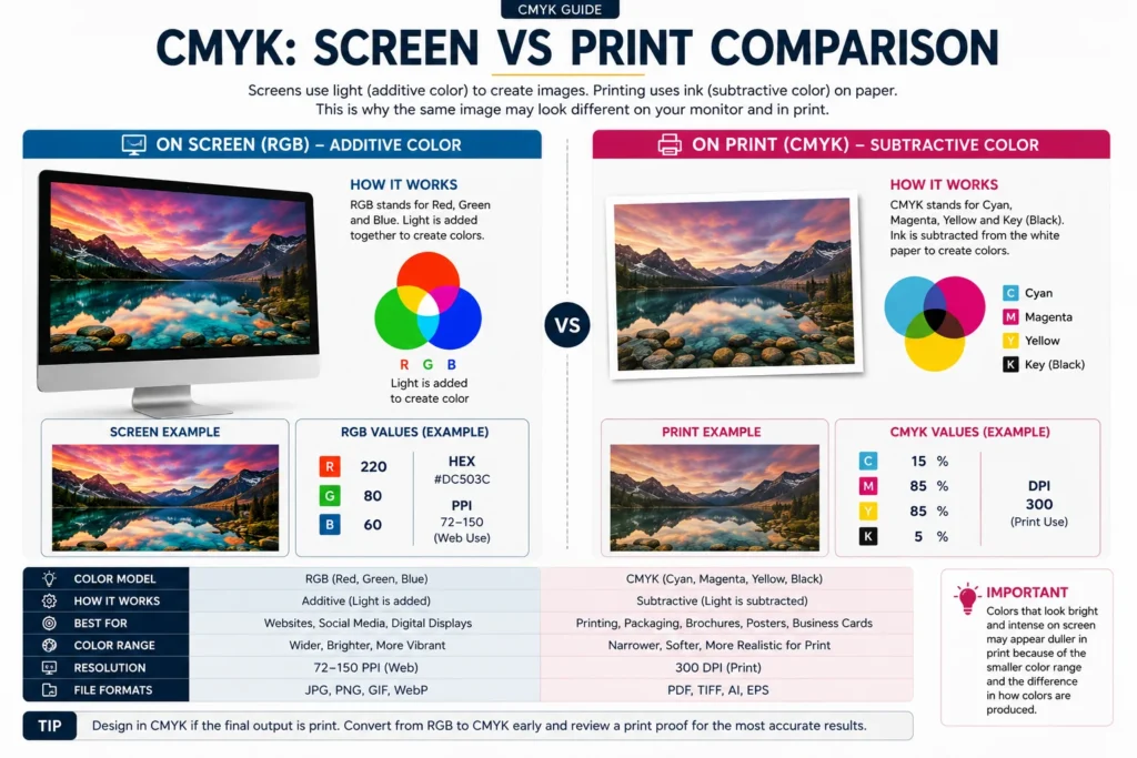
A designer sends us artwork in a bright screen blue and the finished box comes back looking a shade duller than the file did. The call that follows almost always opens with the same sentence which is that the color on the monitor was not this one.
In nearly every case nothing went wrong on the press at all. A screen and a printing press build color in opposite directions so the two were never showing the same color to begin with. A screen gives off its own light. Ink on board can only absorb part of the light falling on it and send the rest back to your eye. Once that single idea is clear, most color surprises in packaging stop being surprises and start being things you can predict.
The short version
- A screen adds light and ink takes light away, so the two were never showing you the same color.
- Convert to CMYK yourself, inside your own file, rather than leaving it to the press. You still have time to adjust what you can see.
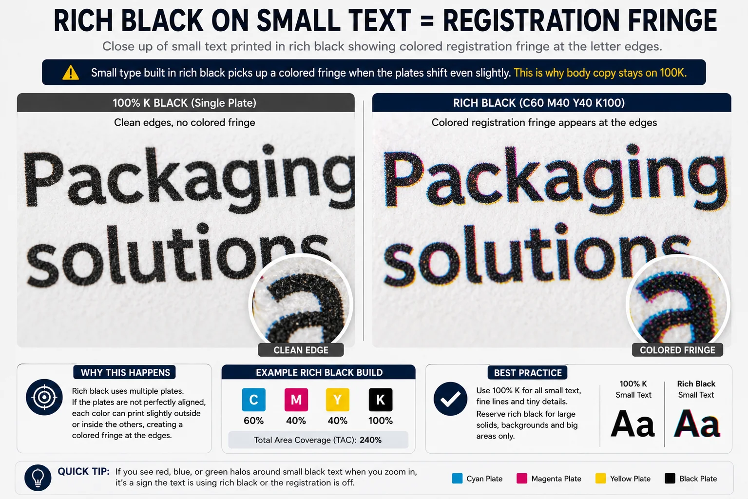
- A big black panel needs rich black, small text needs 100K black on its own. Mixing that up is the commonest artwork fault we see.
- Four process inks cannot make metallic gold. Only metallic ink or foil throws light back at you.
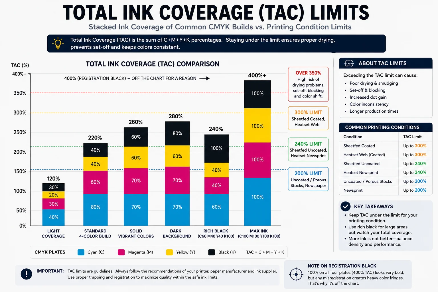
- Keep total ink under about 300 percent on coated stock, and never use the registration swatch in artwork.
What Does CMYK Actually Mean?
CMYK stands for cyan, magenta, yellow and key, and key is the printing trade’s word for black. The CMYK meaning is therefore nothing more complicated than a list of the four process inks a press actually loads. Those four inks are laid down one after another on the sheet, and between them they build every other color you see on a printed box. Almost all commercial CMYK printing on packaging works this way.
The definition of CMYK is that it is a subtractive color model which is a technical way of saying that ink takes light away rather than adding it. White board reflects almost every wavelength of light straight back at you. Each dot of ink sitting on that board absorbs some of those wavelengths and returns whatever is left. Adding more ink therefore means less light coming back to your eye so the printed color grows darker as the ink builds up rather than brighter.
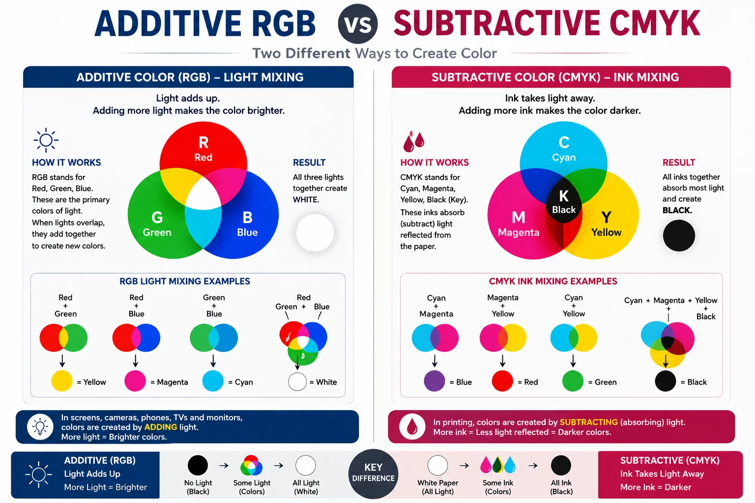
A screen works the other way around from beginning to end. It starts from a black panel and adds red, green and blue light until all three channels together produce white. Because the two systems are doing physically opposite things, the set of colors each one can produce is different. The places where they disagree are exactly where color problems appear.
Why Does the K Stand for Key Rather Than Black?
The K comes from the key plate, which in traditional color separation is the plate that carries the fine detail and the outlines of an image. That plate was almost always printed in black and the other three separations were lined up against it. So the letter attached itself to black and never came loose.
A press needs a fourth ink because three are not enough in practice. In theory cyan and magenta and yellow at full strength ought to absorb everything and leave you with black. Real ink pigments are not the perfect primaries that theory assumes. Pushed to full strength together they give a muddy dark brown instead of a clean neutral. That is no use behind body copy or in the shadows of a photograph.
Dedicated black ink fixes several problems in one move. It gives you a genuine neutral black instead of a brown one. It lets fine type print from a single plate rather than from four plates that all have to line up perfectly. It also cuts the amount of ink going onto every dark area of the sheet. That saves both money and drying time on a long run.
What Is the Difference Between RGB and CMYK?
The whole RGB vs CMYK question sounds academic until a box arrives in the wrong blue. The difference that actually costs money is the color gamut which is simply the range of colors that a system is able to produce. A modern screen can show plenty of bright colors that four process inks cannot reproduce at the same strength. That gap is where most disappointment lives.
Electric blues are the clearest example, along with the fluorescent greens, intense oranges and some of the more vivid reds. When a color like that sits outside what the inks can reach, the conversion does not stop and warn you about it. The color management system quietly maps it to the nearest color the press can actually print. Depending on the profiles involved and the rendering intent you chose, the result comes back either less saturated or slightly shifted in hue.
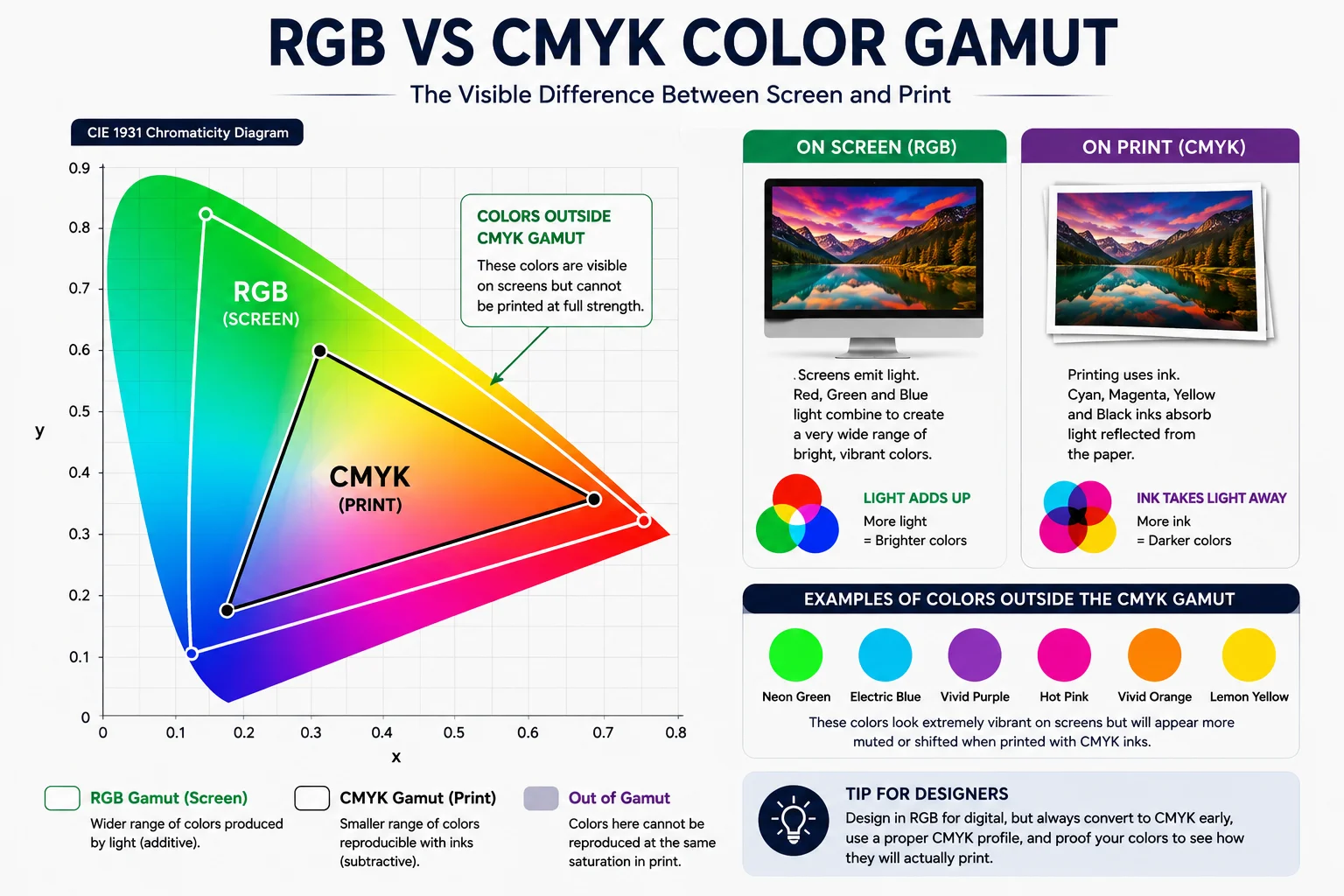
Make it yourself. When you convert inside your own file you watch the shift happen and you still have time to adjust the artwork around it. When you leave the file in RGB you see the result for the first time on a finished box. That single decision is what printing in RGB vs CMYK really comes down to on a live job.
How Do You Translate RGB to CMYK Correctly?
There is a formula for this and there is a working method for this, and confusing the two is the source of a great deal of trouble.
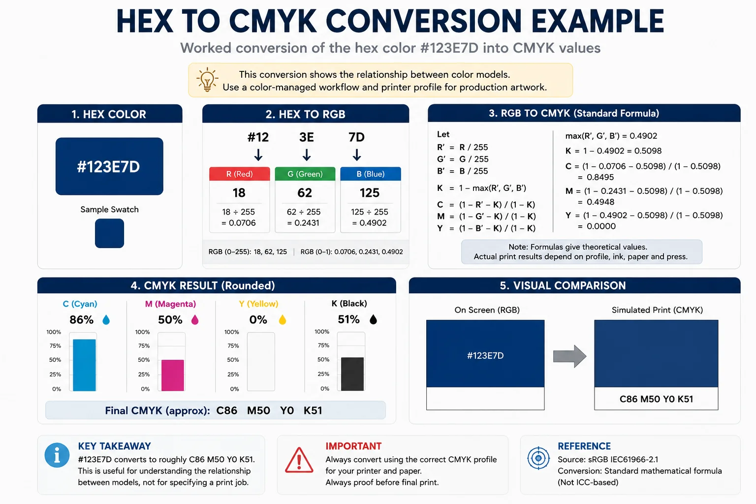
The formula is the one that sits behind every free converter on the internet. It normalizes each of the red, green and blue channels and works out the black component from whichever channel is strongest. Cyan, magenta and yellow are then derived from whatever remains. Run our own brand navy through it and the arithmetic is clean enough. The hex value #123E7D is red 18, green 62 and blue 125 and the formula hands back roughly C86 M50 Y0 K51.
That result is worth having as a way of understanding how the numbers relate to each other. It is not a print specification and nobody should treat it as one. The formula has no idea which press the job is going on, what inks are loaded, what board is being printed. What the measured behavior of that whole printing condition looks like. It is arithmetic performed in a vacuum.
People sometimes need to translate CMYK to RGB as well, usually to build a web banner or a product listing from artwork that was made for print. That direction is easier because the screen gamut is wider, so the colors have somewhere to go rather than being squeezed. Production artwork should be converted through a color managed workflow built on ICC profiles instead. A profile is a measured description of how one real printing condition behaves. So the source profile and the destination profile together decide how your color gets translated rather than a formula deciding for you. In Adobe applications this means using Convert to Profile with the destination your printer has asked for. The important part is not converting to CMYK in general but converting for the specific printing condition your job will actually run under.
How Do You Convert a Hex Code to CMYK?
A hex code is just another way of writing an RGB value. So going from a color hex to CMYK works on exactly the same principles as converting RGB to CMYK does.
A six digit hex code breaks into three pairs, with one pair for each of red, green and blue. Each pair runs from 00 up to FF in base sixteen. FF works out as 255 in ordinary decimal so the code #FFD662 means red 255, green 214 and blue 98. Putting that through the same formula returns approximately C0 M16 Y62 K0.
The limits of the arithmetic show up most clearly at the extremes where you can see the gamut problem written out in numbers instead of described in words. Pure screen red is #FF0000 which the formula turns into solid magenta plus solid yellow and nothing else. That combination prints as a perfectly strong red that is simply not the red glowing on your monitor. Pure screen green is #00FF00 which becomes solid cyan plus solid yellow, and there is no press anywhere that will make those two inks look like neon.
A brand guideline that gives a hex code and nothing else is incomplete the moment the brand goes into print. A hex code is a screen value and the person printing your packaging is left to work out the rest on your behalf. Good brand standards give the hex value for digital use, an approved CMYK build for process printing. A Pantone reference where a spot color is going to be involved.
Try it on your own color
Paste a hex code and watch the four ink percentages the formula produces.
This is arithmetic, not a print specification. The formula has no idea which press, which inks or which board your job runs on. Use it to understand how the numbers relate, then convert through an ICC profile for anything going to print.
What Is Pantone and How Does It Differ from CMYK?
Pantone, written as PMS in most specifications because it stands for the Pantone Matching System, is a range of premixed spot inks. A Pantone color is not assembled on the press from four overlapping ink screens at all. It is mixed as one single ink to a published recipe and then printed from its own dedicated plate.
The two systems exist to solve different production problems which is why the choice between them is rarely close once you look at the artwork. CMYK is built to reproduce a very wide range of colors from a fixed set of four inks. That is exactly what a photograph or a complex illustration needs. A spot color is chosen when one particular solid color has to be held tightly across every run. When the color simply cannot be reached by four process inks at all.
There is also a workflow change from a few years ago that still catches people out. Pantone and Adobe stopped distributing the Pantone color libraries inside Creative Cloud applications in November 2022. Getting current Pantone values into Adobe software now means installing the Pantone Connect extension from Adobe Exchange. Artwork built before that change can still carry swatches that no longer resolve properly. So it is worth opening your older files and checking rather than assuming they are fine.
How Do You Convert CMYK to Pantone?
Turning a CMYK build into a Pantone color is the conversion we get asked about more than any other. It is also the one that is most widely misunderstood because the two directions are nothing like equally reliable. Everything below applies just as much when somebody asks for a CMYK to PMS color match, because PMS and Pantone are two names for the same system.
Going from Pantone to CMYK is a straightforward lookup with a defined answer at the end of it. Pantone publishes a process equivalent for its colors. The Color Bridge guide exists precisely so you can see the spot color and its four color simulation printed next to each other on one page.
Going from CMYK to Pantone is a search rather than a conversion, and that distinction matters more than it sounds like it should. Your four percentages describe an ink recipe under some particular printing condition. The question you are really asking is which premixed ink comes closest to the color that recipe produces. Very often there is no exact equivalent at all so the honest answer is a nearest neighbor together with some sense of how close it actually lands.
The reliable way through any of this is to let software narrow the field and then let a physical guide make the decision. A Pantone book is printed with the real inks on real stock under controlled conditions, and no screen anywhere can simulate that however well it has been calibrated.
Why Does Every CMYK to PMS Converter Give a Different Answer?
Put identical CMYK values into three different online converters and you will quite often get three different Pantone numbers back. None of those tools is broken and the reason is that the question they were asked is missing information they need.
A recipe like C86 M50 Y0 K51 does not describe one single measured color that exists independently in the world. It describes an amount of four inks. The color those inks actually produce depends on the printing condition, the ink behavior, the board and the profile behind the numbers.
Three separate things then vary from one converter to the next. The first is the printing condition each tool assumes. The same build prints differently on coated and uncoated stock so a converter assuming coated hands you a different match. The second is which Pantone library the tool searches since the coated, uncoated, Color Bridge and specialty libraries all hold different sets of colors. The third is the method each one uses to decide what closest means. That is either a plain numeric difference or a perceptual formula that weights the comparison more the way a human eye would.
Treat what comes back as a shortlist of candidates rather than as a decision. Watch the suffixes carefully while you are doing it. Pantone 185 C and Pantone 185 U are the same ink printed on coated and uncoated stock. The two look meaningfully different to anybody holding them side by side. A number specified without its suffix leaves your supplier to make that choice on your behalf, and they may not make the one you had in mind.
How Do You Get a Gold Color in CMYK?
A golden color in CMYK is one of the most common requests we see on packaging artwork, and it is also one of the most misunderstood. CMYK can imitate the color of gold, but four process inks cannot reproduce the way real metallic gold behaves. Understanding why saves a lot of disappointment at proof stage.
What your eye reads as metal is not a hue at all. It is the way the surface throws light back in a particular direction. That is why gold appears to move and change as you tilt the sheet under a lamp. Process inks are transparent films sitting on board with no reflective particles in them at all. They can give you the yellows, ochres and browns that suggest gold. They cannot give you the shine that makes the eye accept it.
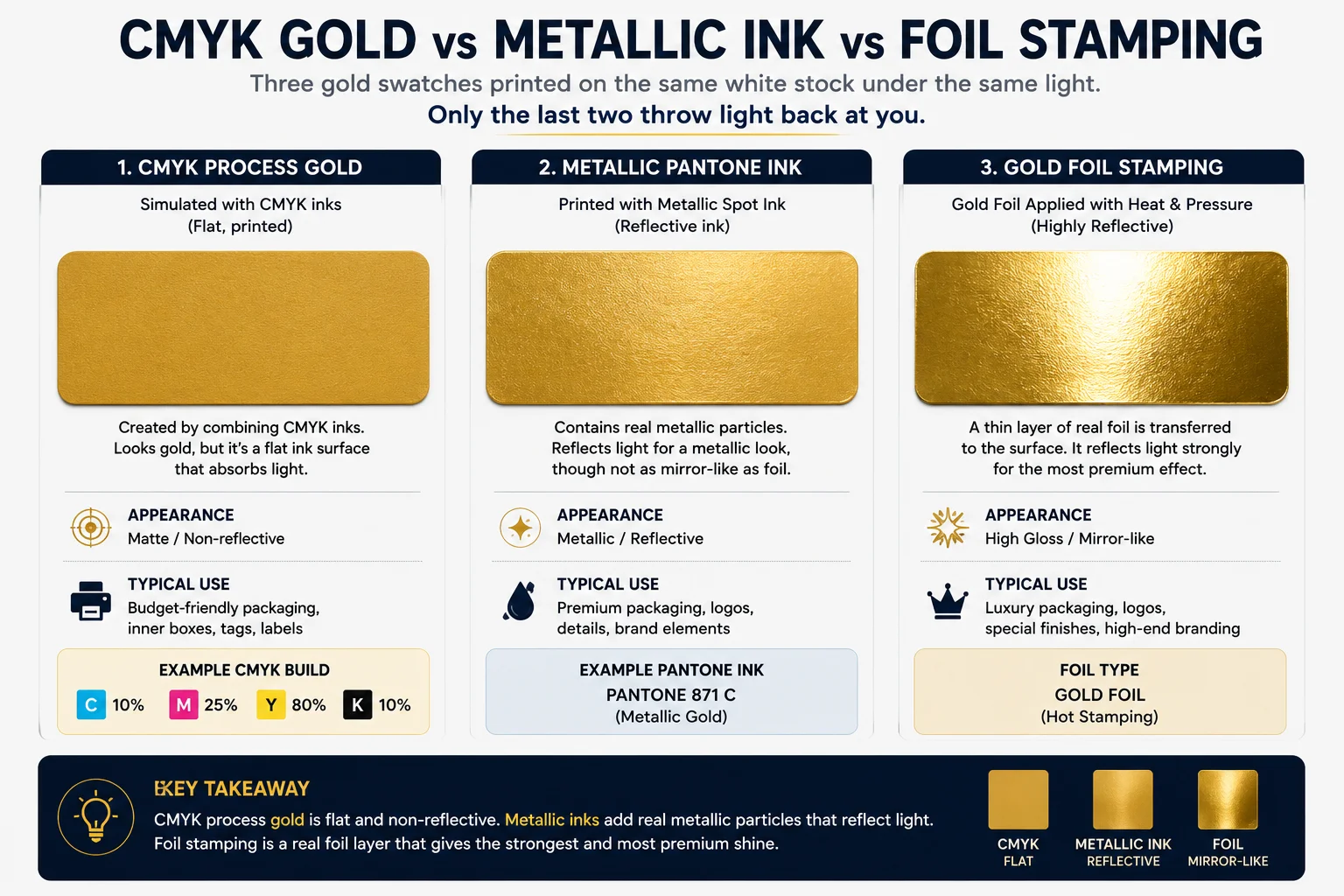
Real metallic effect needs a process built to produce it, and there are two worth knowing about. A metallic Pantone ink such as Pantone 871 carries actual metallic particles in suspension and prints from its own station on the press. Foil stamping presses metallic foil onto the board with a heated die, which transfers real metal to the surface and gives much the stronger effect. For packaging, foil stamping is usually what a brand actually has in mind when it asks for a bright gold logo. It is a separate operation with its own die and its own pass through the shop. It is the reason a foiled logo on a rigid box reads as premium in a way that printed gold never quite manages.
What Is Rich Black and How Do You Build It?
Fill a large panel with 100 percent black on its own and it will very often come back looking like a dark charcoal gray. That is rarely the black anybody had in mind. A single film of ink is not quite opaque enough across a big area and the board underneath keeps returning a little light through it.
Rich black CMYK is the standard answer to that. You keep the 100 percent black and add controlled amounts of cyan, magenta and yellow underneath it. Those supporting inks absorb what the black alone was letting through. The result reads as genuinely deep rather than washed out, and on a large panel the difference is immediately visible.
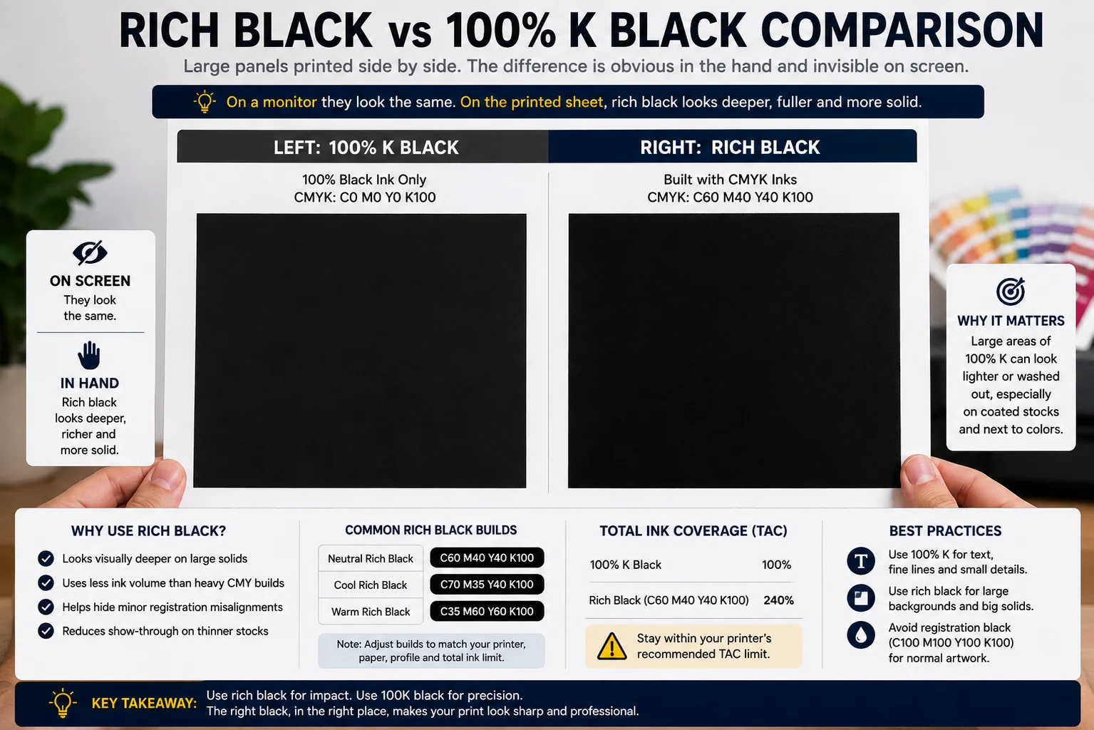
There is no single rich black recipe that is correct for every job which is exactly why you find different numbers quoted in different places. The right build depends on the press, the board, the profile in use and the ink limit that the printing condition allows. What every workable build has in common is 100 percent black plus a supporting mix that stays inside that limit.
| Build | CMYK values | Total ink | What it gives you |
|---|---|---|---|
| Black on its own | C0 M0 Y0 K100 | 100 percent | Correct for small text and fine lines, thin on large panels |
| Neutral rich black | C60 M40 Y40 K100 | 240 percent | A common starting point that is safe on most stocks |
| Cool rich black | C70 M35 Y40 K100 | 245 percent | A slight blue bias that reads crisp and modern |
| Warm rich black | C35 M60 Y60 K100 | 255 percent | A slight red bias that reads softer and warmer |
| Registration color | C100 M100 Y100 K100 | 400 percent | Crop marks only, never artwork |
Two rules keep rich black out of trouble, and between them they cover almost everything that goes wrong with it.
The first is to use rich black on large solid areas and to keep it well away from type. Small text and fine rules belong on 100 percent black by itself. A four color build needs all four plates to register perfectly and any small movement shows up as a colored fringe along the edge of every letter. On a carton that is the difference between ingredient copy that looks sharp and copy that looks slightly out of focus without the reader knowing why.
The second is never to use the registration color swatch anywhere in your design. Registration is meant for crop marks and it is built to output on every separation. That means using it as a design color puts 400 percent ink onto the sheet in a single move. Ink at that level will not dry inside the production schedule, it can pick and blister on the press. It can set off onto the back of whichever sheet is sitting above it in the stack.
Want to see your color on the actual board?
We send a printed proof before your order runs, so the color question gets settled on paper rather than on a screen.
What Is Total Ink Coverage and Why Does It Break Print Jobs?
Total area coverage is the sum of all four ink percentages in any one place on the sheet, and almost everyone shortens it to TAC. A build of C60 M40 Y40 K100 comes to 240 percent, and that arithmetic is simple enough to do in your head while you are working.
Every printing condition carries a ceiling on this, and pushing past it is where ink starts behaving badly rather than simply looking dark. Sheets stick together in the stack and the ink picks off when they are separated. The surface blisters. Drying time stretches well past whatever the schedule assumed. Trapping between inks also starts to fail because the later inks land on wet film rather than a stable surface.
| Printing condition | Recommended maximum total ink |
|---|---|
| SWOP coated number 3 sheet | 300 percent |
| SWOP coated number 5 sheet | 270 percent |
| Supercalendered stock | 270 percent |
| Sheetfed and web uncoated | 270 percent |
| A conservative figure that is safe almost anywhere | 240 percent |
Those bands come from published total area coverage guidance for each printing condition.
Two mistakes cause very nearly every ink limit problem that reaches us in supplied artwork. The first is registration color used as though it were a design color. That usually happens because it appears in the swatch panel and looks like the blackest black on offer.
You can check the number yourself in about ten seconds. The Info panel in Photoshop reads out all four ink values under the cursor so hover over the darkest part of an image and add them together. Anything above 300 percent deserves a proper look, and anything sitting at 400 percent is an outright error.
Which CMYK Profile Should You Use for US Printing?
The right CMYK profile for any job is the one that describes the printing condition your printer is actually going to run. That is worth saying before naming any profile at all.
US Web Coated SWOP v2 has been the common default in American workflows for many years. It remains a sensible fallback when nobody has told you anything more specific. GRACoL profiles describe sheetfed commercial printing on coated stock and give you a wider range of color which suits premium packaging where the color is doing real work. Coated FOGRA39 is the European equivalent and turns up regularly in files arriving from European studios.
So ask before you convert. Any printer can tell you in half a minute which profile they want and whether they have a PDF export preset they prefer. They will also give you the ink limit for your job. Converting to the right destination at your end removes an entire category of unpleasant surprise from the schedule and it costs you one email.
How Do You Prepare Packaging Artwork So the Color Survives?
All of the theory above turns into one short checklist by the time a job reaches production. This is what we ask for on every project and the reason behind each item.
- Supply artwork in the format your printer asks for which is usually a print ready PDF with the editable source file alongside it
- Convert through a color managed workflow using the destination profile your printer supplied rather than picking a CMYK profile at random
- Name every spot color explicitly with its Pantone reference and its C or U suffix attached because that suffix changes the ink
- Build large blacks as rich black and keep small type and fine rules on 100 percent black alone
- Keep total ink inside the limit set by the destination profile or stated by your printer, and never place registration color in the design
- Include the bleed your printer specifies which is 3 mm in most workflows although the packaging specification always decides
- Outline your fonts before sending while keeping an editable master file so the type can still be changed later
- Ask for a printed sample on your actual board whenever the color genuinely matters to the brand
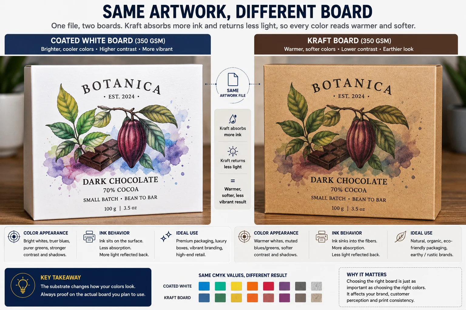
Board choice changes the finished color as much as the ink does, and this is the part that most often gets overlooked until it is too late. The same build prints brighter and cleaner on coated white than it does on kraft. There the brown ground shifts every color warm and takes the life out of pale tints in particular. A design approved on a screen and then printed on kraft is the single most common color surprise in this industry. It is completely avoidable by asking for one sample first.
CMYK Questions Designers Ask
Getting the Color Right on Your Own Packaging
Color problems in packaging stop looking mysterious as soon as you take the whole workflow apart and look at it one stage at a time. The trouble usually starts with an RGB color that was always outside the printable range. A hex value with no approved print build behind it. A CMYK profile chosen because it happened to be sitting in a menu, or a Pantone number specified without any thought about the board it would land on.
None of those is really a mistake that somebody made badly. Each one is a decision that never got made at all and the fix in every case is the same unglamorous thing. Decide the color deliberately, prepare the file for the printing condition it will actually run under. Confirm anything brand critical on a printed sample of the board you are going to use.
We are a packaging supplier in the USA producing custom folding cartons, mailer boxes and retail packaging. Depending on the job that can mean CMYK process printing, Pantone spot colors, specialty finishing or all three together.
If you are not sure how your artwork will behave on a particular board, send the design and the packaging specification through our quote page. Looking at color, stock and finishing together before anything goes to press is far easier than correcting a color problem once the packaging has already been printed.
Talk to us about your packaging color
Send your Pantone reference, the board you have in mind and the finish. We will tell you what that color will actually do on press before anything is printed.
