





Artwork Guidelines
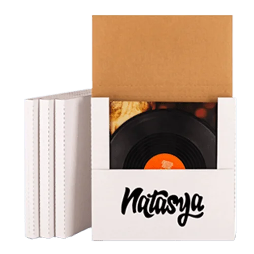
Packaging artwork is not the same as artwork for a screen or a flyer. A box gets cut and folded and glued so the file has to allow for all three. Start with our free dieline generator and then work through each requirement below in order.
Make Your Dieline First and It Is Free
Free generator on this siteAny style at your own sizeAI, PDF and SVG
You do not have to email us for a template because our dieline generator builds one for you in seconds. It sits on this site and it is free to use with no account and no watermark on what you download.
Pick your box style, then type in your own length, width and height in millimeters or inches. The tool redraws the cut lines, creases and glue tabs around those numbers while you watch the preview update. Download the finished dieline as AI, PDF or SVG once the preview looks right to you.
Open the dieline generatorBuild your artwork on top of that file and keep the dieline layer in it when you send the job back to us. Most reprints start with a guessed layout, since folded panels rarely line up the way they did when the sheet was flat.
Generate two or three styles and compare them flat before you commit to one. Each structure folds and locks in a different way and that difference is far easier to see than to describe.
Bleed and Safe Zone
3 mm bleed on all sides3 mm safe margin inside
Extend any background color or image 3 mm past every cut line and that overlap is called bleed. Cutting carries a small tolerance, and without bleed you end up with a thin white sliver along one edge.
Pull your logo and your text at least 3 mm inside the cut line as well and that inner margin is the safe zone. Anything closer risks being trimmed away or landing right on a fold where the ink will crack.
The generator marks all three for you, drawing cuts in red, creases in blue and the bleed outline in green.
A folding carton is less forgiving than a flyer, since it carries cut lines, creases and glue tabs on every panel. One millimeter of drift shows up in several places at once and it is usually visible once the box reaches a shelf.
Color Modes
CMYK for process workPantone for exact matching
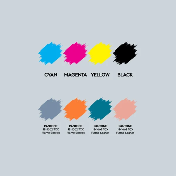
Set your document to CMYK before you begin because both offset and digital presses print with the four process inks.
Pantone is for exact brand color and you should use it when a shade has to look identical on every reprint. Name the Pantone in your file rather than converting it and we will match that ink on press.
RGB only exists on a screen so any RGB artwork you send has to be converted before it can print. Bright blues, greens and oranges tend to shift during that conversion, which is why you should handle it yourself rather than leave it to us.
Resolution
300 dpi at final sizeVector where possible
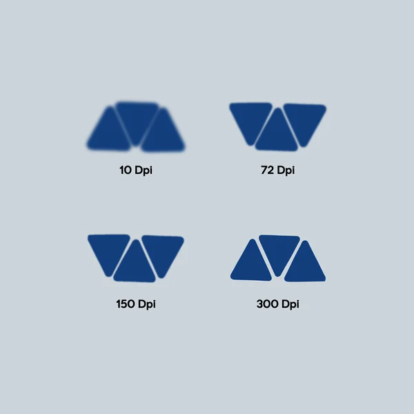
Every placed image needs 300 dpi at the size it actually prints on the panel. A logo sitting 50 mm wide needs 300 dpi at 50 mm wide rather than at thumbnail size.
Web images run at 72 dpi and they look perfectly sharp on a screen but on board they turn soft and the edges break up. Enlarging a 72 dpi file adds no detail either because the pixels simply get bigger.
Vector artwork carries no resolution at all so it scales to any size and stays crisp. That is why we ask for logos and line work as vector whenever you have them.
Fonts and Text
Outline all fontsWatch reversed type
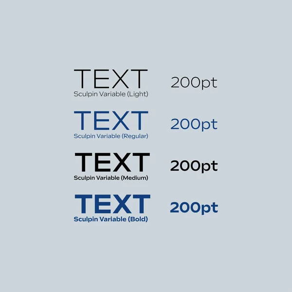
Convert every font to outlines before you send the file, which turns each letter into a shape that cannot reflow. Text you may still want to edit should stay live in your working file rather than in the print file.
Ink spreads slightly on uncoated and kraft board, so small text needs a second look before it goes out. Fine white type on a dark panel can fill in and lose its shape so give reversed text a little more weight than you would on screen.
File Formats
Vector PDFAdobe IllustratorEPS
A vector PDF or an AI file built on our dieline is what we ask for, since both keep type sharp and Pantone names intact.
EPS works just as well if that is what your designer prefers to work in. Flattened formats such as JPG and PNG cannot be corrected once they arrive and they lose a little quality with every save. If a raster image is unavoidable then place it inside the vector file rather than sending it on its own.
Organized Files
Name your layersPackage linked images
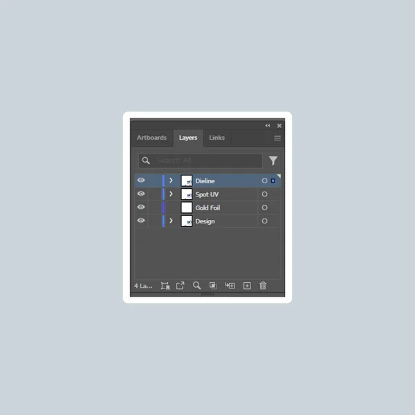
Name your layers so anyone can open the file and understand it without guessing what each one holds. Keep the dieline on one layer and your artwork on another, which lets a clean file move through prepress in minutes rather than hours.
Package your linked images with the file instead of linking to a folder on your own computer. Missing links are the most common reason a job pauses on our side and they are also the easiest problem to avoid.
Special Finishes Need Their Own Layer
One layer per finish100% solid shapes
Spot UV, foil stamping, embossing, debossing and window patching are all made from separate tooling. Each one needs its own layer showing exactly where it goes drawn as a solid shape rather than a shaded or transparent one.
- Spot UV and foil: draw the shape you want treated and label the layer with the finish name.
- Emboss and deboss: keep the shape simple, since fine detail flattens out in the die.
- Window patching: mark the window opening on its own layer so the film is cut to match.
A finish drawn on the artwork layer gets printed as ink instead of being made as tooling. Keeping each one separate is what turns a flat design into a box you can actually feel.
What Happens After You Send It
Our design team reviews every file at no cost, checking resolution, bleed, fonts, color and the finish layers. Files built on a generated dieline usually clear that check on the first pass.
You can ask for a flat view or a 3D mockup before production starts and both of those are free. Production then runs 8 to 10 business days from the moment you approve the dieline.
Before You Send the File
Built on a generated dielineDieline layer still in the file
3 mm bleedOn every cut line
3 mm safe zoneLogo and text pulled in
CMYK or named PantoneNo RGB left in the file
300 dpi at final sizeVector for logos
Fonts outlinedNo live type in the print file
Layers namedDieline and artwork separate
Finishes on their own layersSolid shapes, labeled
Send It Over When You Are Ready
Generate your dieline on the dieline page then attach the finished artwork to the quote form or email it to sales@thecustomizedboxes.com. If you would rather talk it through first then call +1 703 350 4739 and we will walk through the file with you.