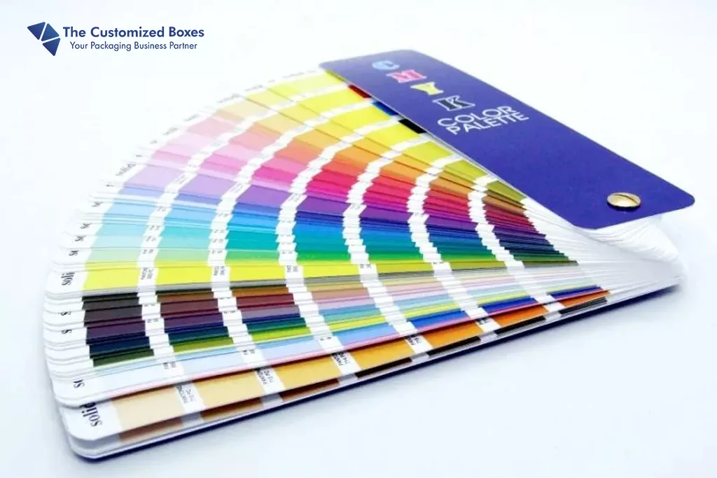
Commercial printing equipment uses the CMYK color model, which stands for cyan (C), magenta (M), yellow (Y), and black (K for “key”). This color style provides world-class drawings and pictures. Through achieving a comprehensive spectrum of light, the various color inks mix in variable proportions throughout the production process.
Around 1440, Johann Gutenberg created the printing press; nevertheless, Jacob Christoph Le Blon created the three-color printing press.
His first color scheme was RYB (Red, Yellow, Blue), which produced the colors orange, purple/violet, and green when red and yellow were combined.
All three main hues (red, yellow, and blue) still had to be blended to get black. He created the four-color printing technology after adding black as a shade to his press and seeing the seeming inefficiency.
He was the first to use the term “Key” for black and referred to it as RYBK. It carried over into the CMYK color model, which followed the legacy of the letter “K” by using the same name for black.
The “K” for “key” stands for “black,” and it denotes the alignment of the printing plates to the black printing plate. Process color and four-color process are other names for CMYK color.
(Difference between RGB(for digital use like LOGO,DIGITAL IMAGES & CMYK( for PRINTING PURPOSE)
The CMYK Color Model: What Is It?
The four primary colors that make up the CMYK color model are cyan, Magenta, Yellow, and Black. The fact that it is a layer-by-layer basic dye is what we find fascinating about it. Pigmented ink lowers the light generally reflected on the initial white paper when using a subtractive hue.
Generally speaking, the amount of color on white paper affects how much white light reflects; in other words, the quantity of pigment reduces how much white light reflects. Darker shades of red, green, and blue can be created by layering and combining different shades.
Very dark brown or black, or the elimination of the lightest reflection, are the most intense color combinations. It produces by overlaying the three primary colors—cyan, magenta, and yellow. If a CMY color ink cartridge is used in a printer, it occurs.
However, adding black to the ink cartridge is customary to cut down on the amount of color ink required and minimize the cost of ink. Additionally, as already indicated, complete saturation of the three hues will often produce an extremely dark, muddy brown.
The black ink will enable artists to get the most accurate color in some areas of their work because it does not attain full black. Furthermore, black ink dries printed pictures more rapidly than full saturation, which takes longer to dry.
The Purpose of CMYK
The ineffective use of the RGB color model in printing led to the development of the major color model.
In the RGB color paradigm, white, which is often the most prominent shade for a page including text, would need mixing three inks (red, green, and blue).
Although paper is already a shade of white, employing the RGB scheme is inefficient, given the volume of ink necessary to print on white surfaces.
The Cyan, Magenta, and yellow color scheme emerged as the ideal printing option. Yellow and cyan produce green, whereas yellow and magenta produce blue, red, red, and yellow, respectively.
As was just said, all three hues need to be mixed to get black, which is why we use the word “key.” As a result, fewer colors and patterns are printed using ink.
As colors must always be subtracted to produce different shades that finally equal white, CMYK is regarded as a subtractive color scheme.
Implications of CMYK in Packaging
Digital screens currently only reflect real-world pictures using RGB. When designing Kraft paper box packaging using programs like Adobe Illustrator, it is essential to move your design files to the main color scheme, as this is no longer often used for printing on packaging.
Doing this will produce more precise results from the screen to the finished product. When making branded packaging, the RGB color scheme may present hues that printers cannot accurately match, leading to uneven printing.
Since it uses less ink overall and produces more precise color output, the Color space system has grown in popularity for packaging. Utilizing the cyan (C), magenta (M), yellow (Y), and black color systems, custom packaging is adequate for offset printing, flexo printing, and digital printing. It produces consistent brand colors for great branding chances.
CMYK: What Is It Used For?
There are many steps involved in planning and creating a product, especially when it comes to color if someone wants to make a certain one. Consider whether the vibrant colors will appeal to the general public or whether the hues will cause the viewers to feel a certain way.
Choose the appropriate color model to enter and show the pigments in their most accurate state. Although it is helpful to keep in mind the general rule: cyan (C), magenta (M), yellow (Y), and black color model for each output project, there are several circumstances in which it is advisable to employ these color features.
Several typical uses include:
- Artwork: Posters, signage, and prints
- Marketing: Advertisements, billboards, flyers, brochures, business cards, stationery, decals, magazines, color newspapers, and publications
- Merchandise: Apparel with a logo or graphic design, furniture, workplace supplies, and product packaging
Naturally, there are times when someone could want a design that looks well on both screens and in print. Even though the finished item is converted to cyan (C), magenta (M), yellow (Y), and black color systems for printing, graphic artists frequently work in RGB in these situations.
What Benefits and Drawbacks Does CMYK Have?
Although it is simple to reduce cyan (C), magenta (M), yellow (Y), and black color systems to printed media, it is helpful to be aware of the benefits and limitations of choosing this color model over others. As artists and designers, users might feel more in control of their work since they know the motivation for its use.
Perks
- For the majority of printing enterprises, it is the norm. This type of artwork and file format should be accessible by the printer you’ve selected. The majority of home printers also use these color schemes.
- If they have previous expertise in the business, clients would typically anticipate work to be cyan (C), magenta (M), yellow (Y), and black color systems.
- Compared to other forms of shade space, it requires less knowledge of color theory.
- Halftoning is a special form of printing that is less expensive.
- Cyan (C), magenta (M), yellow (Y), and black color combinations are used in a wide range of media.
Limitations
- The colors will not transition from RGB format cleanly.
- There are only a few color options.
- If you select a color that is not within the printer’s capabilities, the color seems drab.
- For all these reasons, printed color swatches may be required before or throughout the design process.
How to Design with CMYK?
When designing a product that will only be printed digitally, working directly in CMYK is a great alternative. Users may design a web-based product in RGB and then convert the file to CMYK format if it will be printed. It will need accuracy and careful editing to accomplish a perfect color conversion.
It works with cyan (C), magenta (M), yellow (Y), and black color systems that decreases the chance of visible color shifts during the conversion. Furthermore, it removes the need to print hue samples before or throughout the design process to ensure the final product is comparable to plans.
The first step in designing cyan (C), magenta (M), yellow (Y), and black color systems is ensuring that any software application supports that color model. The format is supported by the most prominent software applications for graphic creators and artists, making it simple to identify the appropriate color model option.
Some product lines will allow you to select the document’s intent, automatically altering the mode to the matching color model.
Understanding these file formats is beneficial since using the correct ones will allow creative art or designs to open and print correctly. The following file formats are accepted:
- AL: It is a typical file format since many designers use Adobe Illustrator to generate their work.
- EPS: It is a standard vector file format for huge, high-quality, or highly detailed artwork.
- PDF: A safe choice is PDF if designers are still trying to figure out which file type the printer likes.
- TIFF: It is a widely used file format in addition to PDF.
Although it may be tempting to utilize alternative file formats such as JPEG, JPG, GIF, or PNG because many people have gotten accustomed to them through the internet, they are only appropriate for digital material.
CMYK Printing Instructions
Continuous toning and halftoning are two widespread printing design processes. Continuous toning, often known as contone, produces each hue as a single tone. Halftoning, on the other hand, makes use of tiny, closely spaced colored dots. When examined under a microscope, the picture will have a gradient appearance. People, however, will experience a continuous tone picture with their naked eyes.
Halftoning is a widespread technique in this significant printing. Cyan (C), magenta (M), yellow (Y), and black color systems could only print seven neutral colors without halftoning. The main colors are cyan, magenta, yellow, and black. Green, blue, and red are possible color combinations.
On the other hand, Halftoning may produce a broad spectrum of hues due to the unnoticeable, yet considerable, gap between the dots. The size or area of the dots affects how dark or bright the colors appear since there is a white surface between the dots, therefore the greater the space, the more white light reflects.
Moving CMYK Color Forward
You should now feel confident about handling printed work as an artist or designer. You now know how to create and print using the primary color model and why it is commonly preferred over the second most popular color model, RGB.
It would be best if you were confident in generating high-quality printed art after practicing Cyan (C), magenta (M), yellow (Y), and black color systems in your chosen software packages and seeing how it looks on white sheets of paper.
Conclusion
Color theory is one of your most significant resources as an artist or designer for making essential color selections and producing perfect color combinations also custom packaging. The study of aesthetically appealing visual art or graphic design is called the science of it.
Similarly, understanding how color models and schemes operate may be a huge help when designing a user-friendly website or an eye-catching brochure. Finally, you may create excellent and deliberate effects by understanding and applying various color models.


